Case Study
Vestiaire Collective: Enhancing Seller Experience to Drive Marketplace Supply
![]()

PROBLEM
On the world leading marketplace for pre-owned luxury goods Vestiaire Collective, seller supply encounters difficulties: listings are unfinished, successfully listed items and even sold items are never shipped, and sales have to be cancelled and refunded.
BUSINESS VALUE
Marketplaces thrive and expand when they have a steady and growing supply. In a highly competitive landscape, continuous growth is crucial and staying stagnant can lead to a decline in business performance.
SCOPE
Identify the reasons that hinder the increase in the seller supply success, from the beginning of the user listing process to the successful reception of listed items and payment.
Recommend and implement improvements to increase seller supply and enhance the seller experience, including the option for a revamp if necessary.
Recommend and implement improvements to increase seller supply and enhance the seller experience, including the option for a revamp if necessary.
ROLE, TEAM, RESPONSIBILITY
I was the Senior Product Manager at Vestiaire Collective.
For this project I did product management and UX design:
I worked closely with a diverse team consisting of one UX/UI designer, two backend developers, one web developer, one iOS developer, and one Android developer to achieve the final outcome.
For this project I did product management and UX design:
- data analysis and user research to find the root causes of the problem
- design sprints to tackle every cause
- wireframing and prototyping
- usability testing
- low-fidelity design
I worked closely with a diverse team consisting of one UX/UI designer, two backend developers, one web developer, one iOS developer, and one Android developer to achieve the final outcome.
TIMELINE
Sep 2016: Discovery started
Nov 2016: Delivery started
Feb 2017: Launched
Mar-May 2017: Post-launch data monitoring, analysis, and further iterations
Nov 2016: Delivery started
Feb 2017: Launched
Mar-May 2017: Post-launch data monitoring, analysis, and further iterations
PRODUCT DISCOVERY
Key questions:
Approach:
- What is the complete seller journey?
- Where are the touch points?
- Where could possibly go wrong?
- What is the current state of seller listing and shipping performance?
Approach:
- Conduct user research to understand the full journey and
pain points
- Verify every step, touch point, procedure and interface to
identify opportunities
- Use both data and qualitative insights to identify attack points
SELLER USER JOURNEY
By conducting thorough interviews with actual sellers, we acquired a holistic comprehension of their entire experience.

DATA INSIGHTS
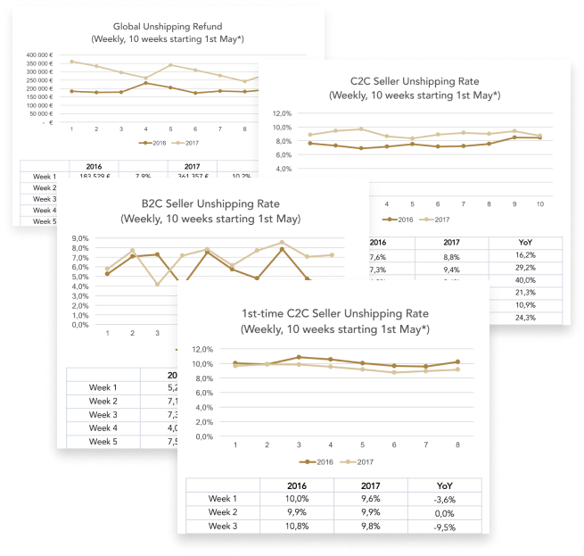
Upon analysing the available data, we uncovered the following insights:![]()
-
On YoY buyer side refund amount has increased.
- The majority of listings are done on mobile.
- iOS is the top seller device, then Android, then desktop.
- B2C seller unshipping rate is very fluctuating but still outperforms C2C, below global level.
- Users with 2+ successful sales have a lower unshipping rate.
ATTACK PLAN
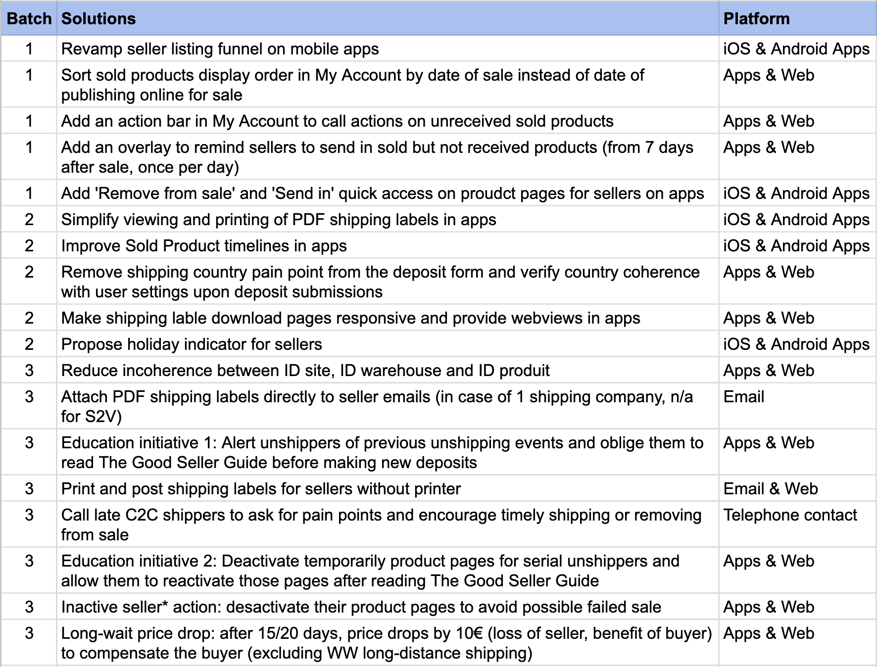
Thoroughly investigating each user journey step and touchpoint, along with data analysis and user interviews, informs our strategic planning.
![Our attack plan by batch]()
Additional ideation sources include brainstorming sessions, desk research, email surveys, customer service feedback, app store comments, and social network insights.
Additional ideation sources include brainstorming sessions, desk research, email surveys, customer service feedback, app store comments, and social network insights.
SUCCESS METRICS
We defined our KPIs from the outset.
- Listing conversion rate - to increase
- Non-shipping rate - to reduce
- Seller NPS - to improve
DESIGN GOALS
We realised and aligned our primary design goals after conducting research.
Assist users contextually
Offer clear visual assistance throughout the listing funnel as needed.
Be considerate and educative
Address user challenges by providing helpful responses. Recognise that people may forget or misunderstand, and aim to improve reminders and educational elements.
Prioritise cross-platform
Prioritise platforms based on usage—iOS, Android, and web, in that order. Mobile first, as it accounts for over 80% of listings.
FINAL DESIGNS
Here are the key highlights of our final designs:

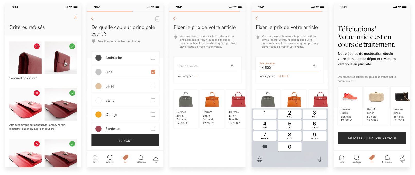
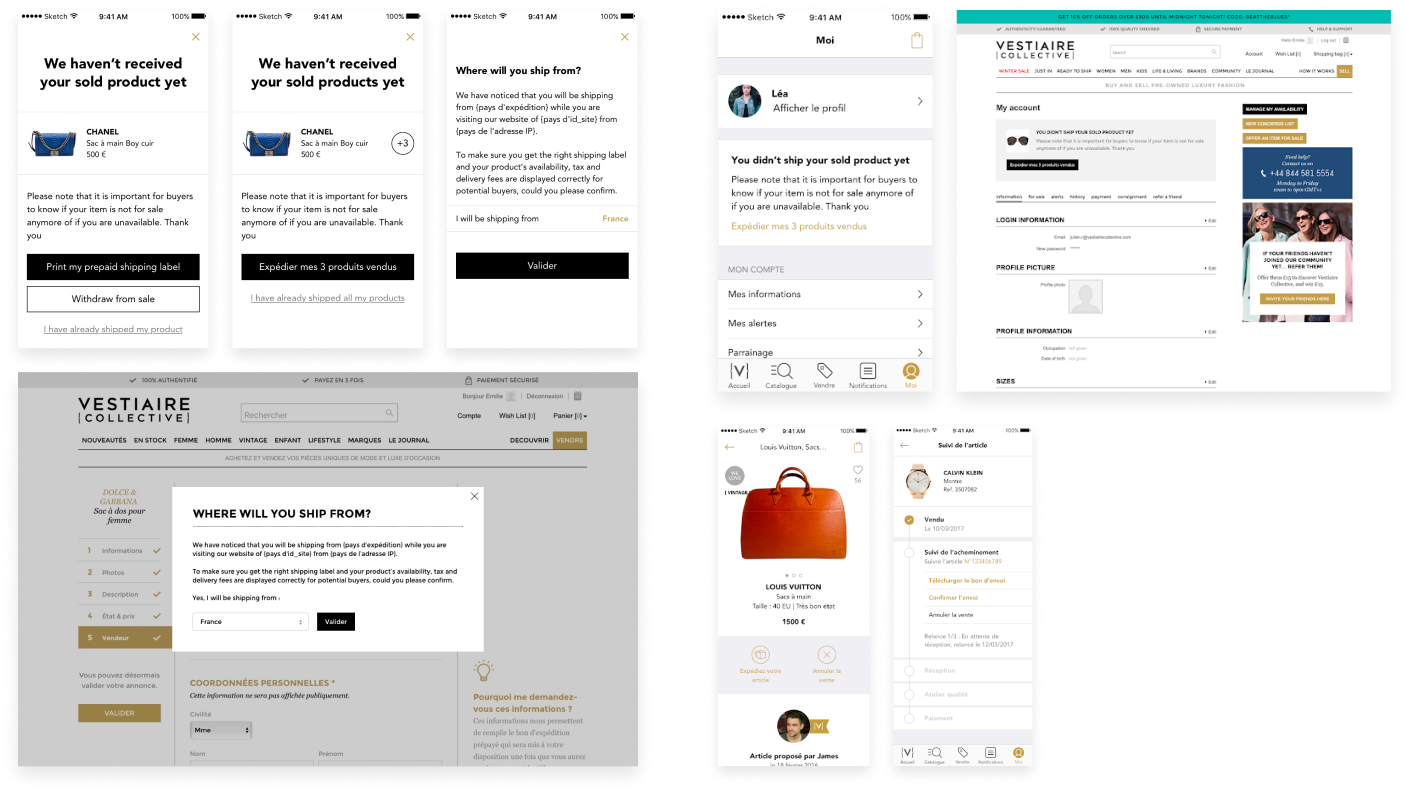
We also A/B tested various designs to optimise conversion.
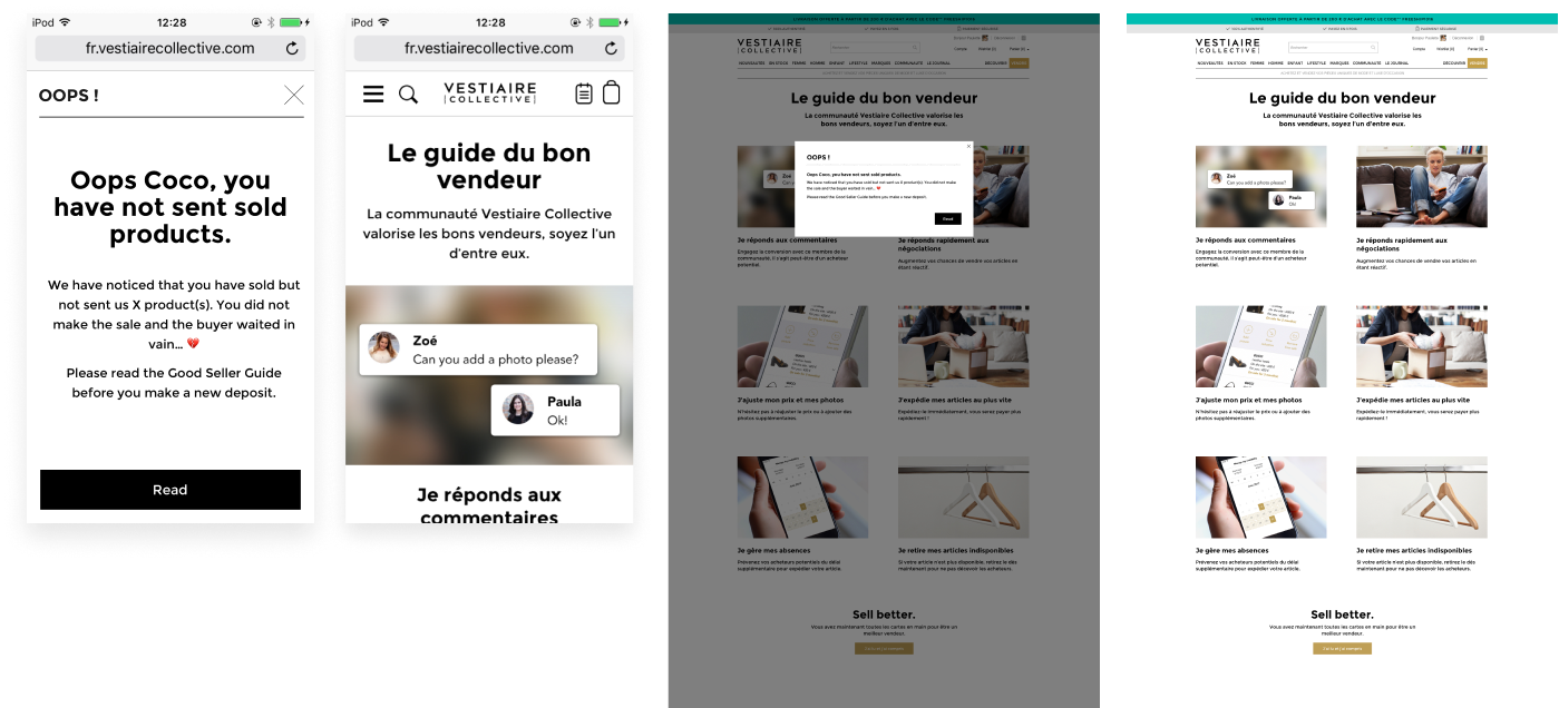
EXAMPLE 1![Sample size 10k visits.]() Hypothesis: If we remove exit points in the header we can increase listing funnel conversion rate.
Hypothesis: If we remove exit points in the header we can increase listing funnel conversion rate.
Result: Conclusive, V2 +3.4% listing conversion vs original.
Sample size - 10k visits.
EXAMPLE 2
![]()
Hypothesis: If we optimise content design, more 1st time users will consult the contextual how-to-sell help article.
Result: Conclusive, V1 +51.8% 1st time seller clicks on the article vs original.
Sample size - 10k visits.
EXAMPLE 3
![]()
Hypothesis: If we modify the place of the CTA ‘Sell another item’, we can increase the volume of repeat listings.
Result: Conclusive, V1 +13.9% clicks on the ‘Sell another item’ button vs original.
Sample size - 35k visits.
EXAMPLE 1
 Hypothesis: If we remove exit points in the header we can increase listing funnel conversion rate.
Result: Conclusive, V2 +3.4% listing conversion vs original.
Sample size - 10k visits.
EXAMPLE 2
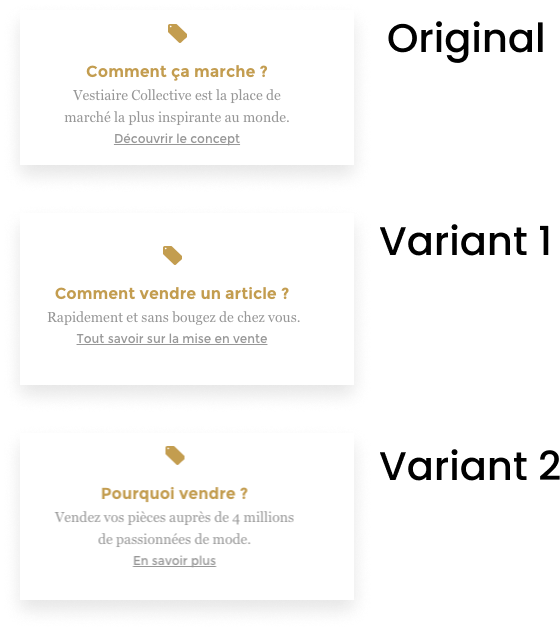
Hypothesis: If we optimise content design, more 1st time users will consult the contextual how-to-sell help article.
Result: Conclusive, V1 +51.8% 1st time seller clicks on the article vs original.
Sample size - 10k visits.
EXAMPLE 3

Hypothesis: If we modify the place of the CTA ‘Sell another item’, we can increase the volume of repeat listings.
Result: Conclusive, V1 +13.9% clicks on the ‘Sell another item’ button vs original.
Sample size - 35k visits.
VALIDATING SOLUTIONS
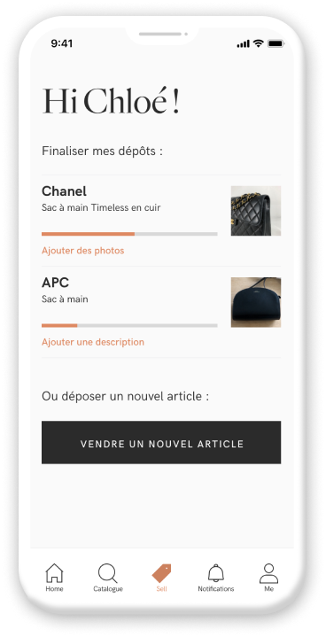
Created interactive prototypes using Sketch, InVision, or Marvel (days before Figma).
![]()
Conducted usability tests with a dedicated group of super user sellers who actively participted in interviews and prototype testing.
Performed guerrilla testing for the new deposit funnel at pop-up stores and cafés.
Conducted usability tests with a dedicated group of super user sellers who actively participted in interviews and prototype testing.
Performed guerrilla testing for the new deposit funnel at pop-up stores and cafés.
DELIVERY
AB test approach:
Some challenges:
- Roll out on selected device, country.
- Monitor data closely.
- Once a significant result comes out, we keep the winning variant and enlarge roll-out audience.
Some challenges:
- Parallel progress with other key initiatives can lead to prioritisation dilemmas during roll-out.
- Dependencies on the operations system for some improvements.
- Economic pressure for immediate results.
OUTCOME
KPI:
C2C features have a significant influence on new seller behaviour.
Qualitative feedback
‘I like the new listing flow on app; it’s clearer and nicer.’
‘If you could collect items in front of my door that’d be top!’
‘Finally the post office follow up info is there!’
- Improved seller listing conversion rate by 20%.
- Reduced seller non-shipping rate by 8%.
- Improved seller NPS by 15 points.
C2C features have a significant influence on new seller behaviour.
Qualitative feedback
‘I like the new listing flow on app; it’s clearer and nicer.’
‘If you could collect items in front of my door that’d be top!’
‘Finally the post office follow up info is there!’
KEY LEARNINGS
- Deep data mining and gathering qualitative feedback from all available channels, including client service, provide valuable user insights.
- Avoid assumptions; always verify even the smallest details. (e.g., one voucher's copy can create confusion).
- Close collaboration with super users yields highly rewarding outcomes.