Case Study
Lofti: Crafting a Tenant Onboarding Experience from Scratch for Efficiency
![]()

PROBLEM
For property letting managers, tenant onboarding is a critical upstream workflow, starting with the tenant's initial enquiry and concluding upon their actual move-in.
Existing market solutions often present challenges in terms of complexity and cost, requiring substantial upfront investments. Users are compelled to navigate a multitude of software tools in conjunction with offline tasks.
Enter Lofti, a Property Tech company introducing a Property Management SaaS product.
BUSINESS VALUE
For our target users, the tenant onboarding flow is instrumental in driving letting revenue and transforming leads into valued customers. It stands as a top-tier business priority in their operations.
For Lofti, it's a make-or-break matter. When prospective users assess property management systems, the quality of the onboarding experience is front and centre. If it’s not fantastic, we won’t attract users and there will be no business for Lofti.
For Lofti, it's a make-or-break matter. When prospective users assess property management systems, the quality of the onboarding experience is front and centre. If it’s not fantastic, we won’t attract users and there will be no business for Lofti.
SCOPE
Create a new streamlined full onboarding experience from scratch to empower letting managers to onboard tenants from enquiry to move-in.
![]()
This is a component of the growing Lofti platform, which encompasses other modules within the SaaS web application and mobile apps.
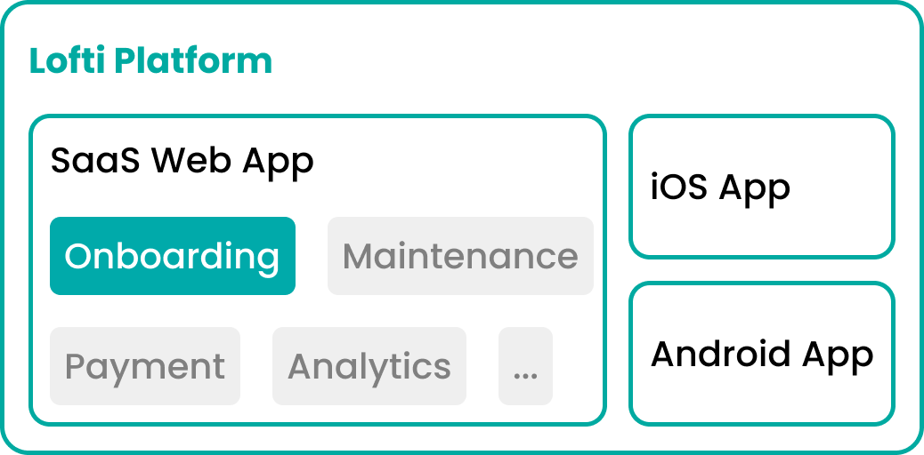
This is a component of the growing Lofti platform, which encompasses other modules within the SaaS web application and mobile apps.
ROLE, TEAM, RESPONSIBILITY
I am the Product Design Lead at Lofti.
For this project, I:
For this project, I:
- conducted end-to-end design;
- took on product management responsibilities before the arrival of a dedicated product manager;
- led a team of four engineers, consisting of two backend and two frontend engineers, to deliver the desired experience.
TIMELINE
March 2021: Research phase commenced
March to June 2021: Conducted workshops and concept development
June to August 2021: Prototyping and usability testing completed, followed by the start of implementation
January 2022: Successfully launched the MVP
January 2022 to Present: Continuously iterating and improving the product
March to June 2021: Conducted workshops and concept development
June to August 2021: Prototyping and usability testing completed, followed by the start of implementation
January 2022: Successfully launched the MVP
January 2022 to Present: Continuously iterating and improving the product
PRODUCT DISCOVERY
We initiated our research by seeking answers to the following pivotal questions:
- Current Workflow: What is the existing process or workflow that users follow?
-
User Profiles: Who are the primary users? What are their roles, demographics, and characteristics?
- Tech Proficiency: How tech-savvy are the users? Are they beginners, intermediate, or advanced users?
- Usage Patterns: What are their typical usage habits? How often do they interact with the product?
-
Pain Points: What pain points or challenges do users currently experience with the product or workflow?
USER JOURNEY
Conducting in-depth interviews with real-life target users allowed us to gain a comprehensive understanding of their journey.
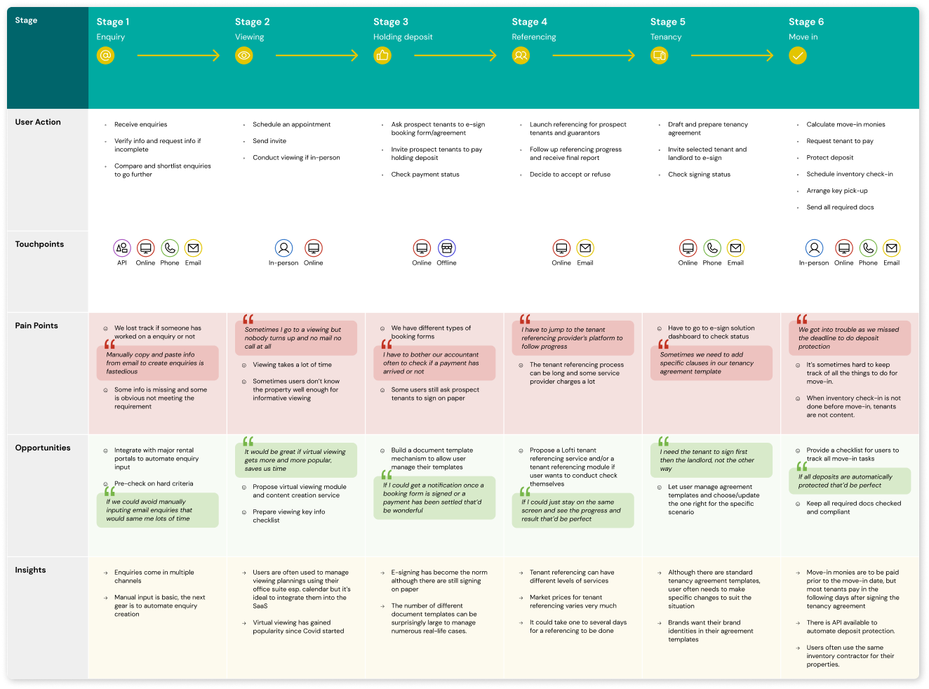
Additionally, we acquired valuable insights into our target users:
- Users primarily engage with the core flow on desktop.
- Users represent diverse age groups and backgrounds, with a generally moderate level of tech proficiency.
- Functionality and ease of use are their top priorities.
- They typically have a moderate to low sensitivity to design aesthetic.
DEFINE MVP SCOPE
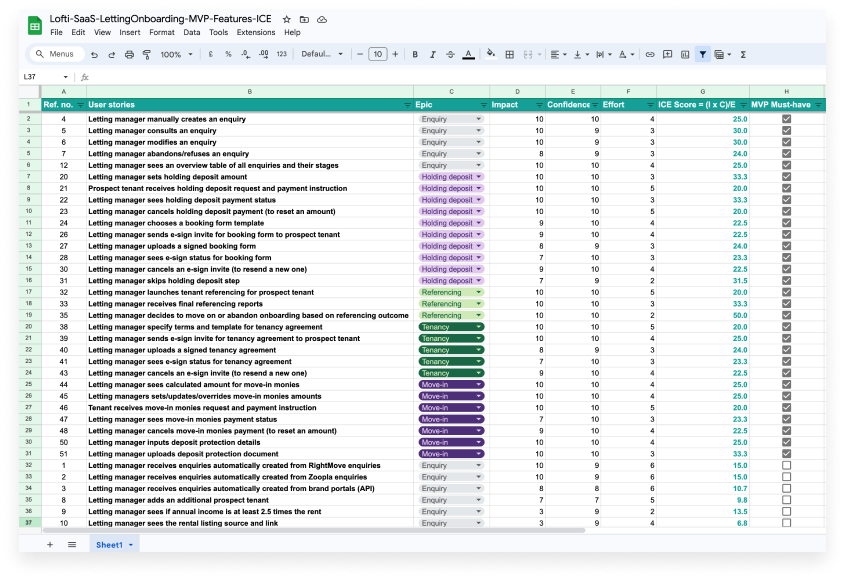
We mapped the user journey to 6 groups of user stories, and used the ICE framework to assess and prioritise.
The 6 groups correspond to the 6 stages:
![]()
The 6 groups correspond to the 6 stages:
- Manage Enquiries
- Coordinate Viewing
- Process holding deposit and booking
- Order tenant referencing
- Draft & sign tenancy agreement
- Collect funds & prep move-in
SUCCESS METRICS
We established KPIs that are meaningful, relevant, and measurable:
-
Onboarding admin time
- Tenant referencing cost reduction
- Tenant satisfaction
BENCHMARK & INSPIRATION
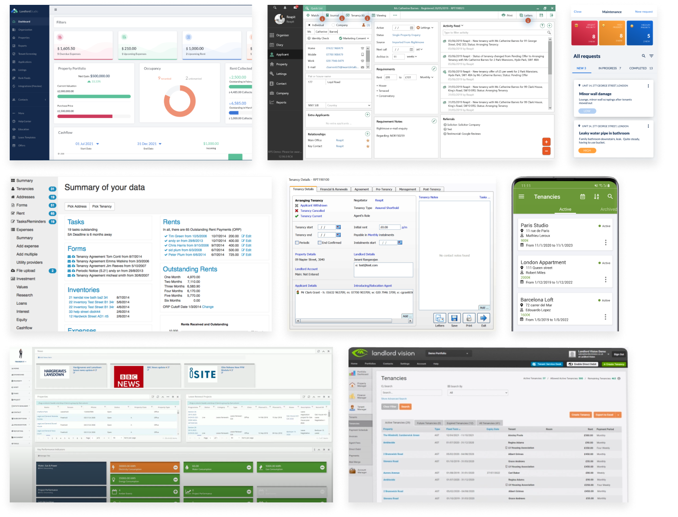
We conducted research on competitors, players in adjacent verticals, and analogous leading SaaS companies in other industries.
![]()
![]()
DESIGN PRINCIPLES
After thorough research and analysis, we've distilled our findings into a set of design principles that guide our project:
Prioritise information hierarchy
Balance necessity and visual simplicity while organising and displaying information thoughtfully and at the right time.
Streamline user flow
Keep property managers focused on task completion by minimising unnecessary choices.
Provide user assistance
Establish seamless links between property, tenancy, and tenant as needed.
Leverage familiar mental models
Property managers often rely on Excel and tables as their default format. Align with their existing preferences.
Pay special attention to different states
Given the numerous use cases, it's crucial to handle various states meticulously.
Establish a design system from the beginning
Implementing a design system early on can promote consistency, enhance user familiarity, and streamline design and implementation efforts for the team.
EXPLORATION & IDEATION
With these design principles as our compass, the creative exploration and ideation process began.
Approach: Translate ideas into design proposals with interactive prototyping for rapid feedback from target users.
Adapt to the user audience: Recognising user difficulties in transitioning from wireframes to final visual flows, I introduced visual design to simplify and expedite the process.
Early design system build-up: Additionally, I initiated the development of our design system early, providing ample time for refining key components and ensuring consistency throughout the project.
PROTOTYPE & VALIDATION
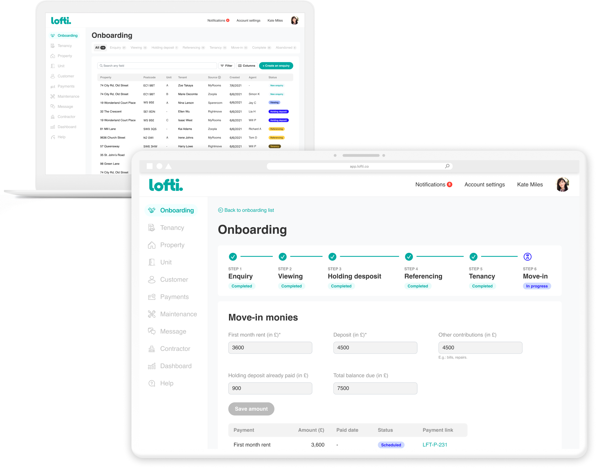
We created an interactive prototype of the entire onboarding flow in Figma and conducted usability tests with five target users to validate our solution and collect feeback.
DELIVERY
Global progress proceeded as planned.
Engineers requested design detail changes along the way, which were collaboratively implemented to strike a balance between technical complexity and UX/business value.
We encountered some delays related to managing document templates with third-party e-sign solutions, revealing complexity during implementation.
OUTCOME
KPI
Reduce onboarding admin time by 70%.
Reduce tenant referencing operation cost by 50%.
Tenant satisfaction increased by 20%.
Qualitative feedback
‘It’s easy to use.’
‘Time saver!’
‘It could be better if we have our office calendar and email directly in it.’
Feedback informs our roadmap and with further research we continue iteration on the product since its launch.
LEARNINGS
Our team has gained valuable insights from this project, and here are some key learnings to share:
-
In a complex problem space, thorough research and understanding are essential. It's a dynamic field, and there's always something new to learn.
- No single product can satisfy every user completely. Striking a balance between product positioning, design principles, and flexibility is crucial.
-
B2B clients often seek tailor-made solutions. Modular, brand-configurable solutions offer a practical approach.
-
Tech and operational complexity should not be underestimated. Hidden costs, such as managing agreement templates, can be significant.