PROBLEM
Tennis fans have difficulty finding holiday tours which perfectly combine tennis tournaments, linguistic stay, and deep travel, allow high level of personalisation, and promote immersive discovering and learning, for both adults and children.
PROCESS
User Interviews
To understand users’ needs and define the user outcomes from the start, interviews have been conducted to find out the answers to three key questions:
1. What is the user trying to accomplish?
- Visit world class tennis tournaments and watch top level matches
- Tour the host countries and discover different cultures
- Learn to play or improve tennis with professional coaches during holidays
- Learn/improve languages in the native countries and in an immersive way
2. How does the user want to feel during and after this process?
- Excited, eys and mind opened, curiosity satisfied
- Great to have experienced what many have not
- Joy of playing and improving tennis game
- Happy to explore new countries/cultures and connect to new people
3. How does our product get the user closer to a life goal or dream?
- Be a person highly knowledgeable, having lots of experienced and travelled around the world
- Develop a great body and live a healthy lifestyle by playing tennis
- Connect to other people in different cultures, enrich social experience
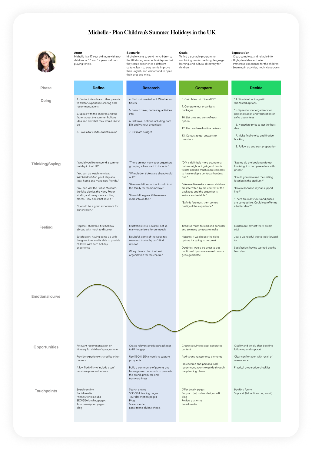
User Journey Mapping
![]()
![]()
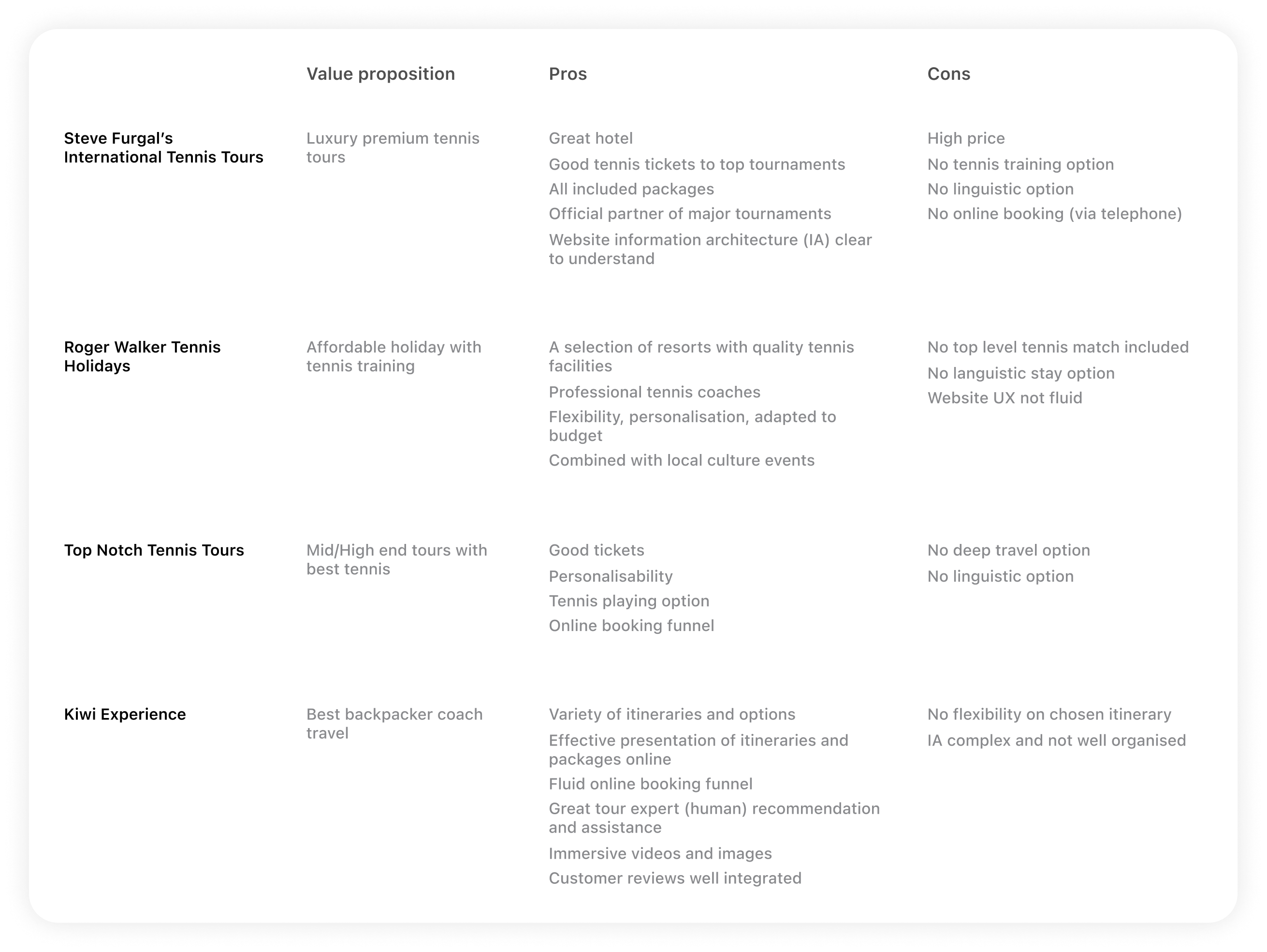
Product Research
There are a number of tennis tour organisers addressing different market segments.
What existing organisers fail to deliver is personalised holiday experiences promoting learning for tennis fans, adult and children.
Ace Holidays centres holidays on the best tennis in Europe, makes packages highly personalisable, and promotes various options of learning experiences.
![]()
Wireframes
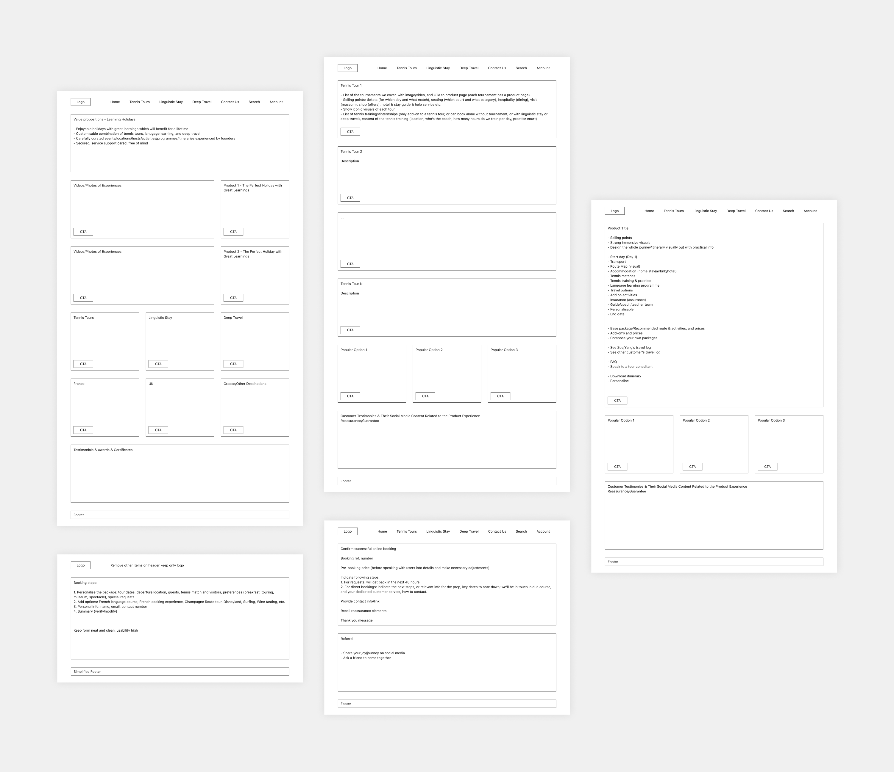
My approach for responsive website design is as follows.
First wireframe on desktop to include all relevant information - this avoids missing any useful info during ideation.
Then design UI on mobile first from the desktop wireframes - this forces prioritisation and pushs further reflection on information architecture as mobile screens have more constraints.
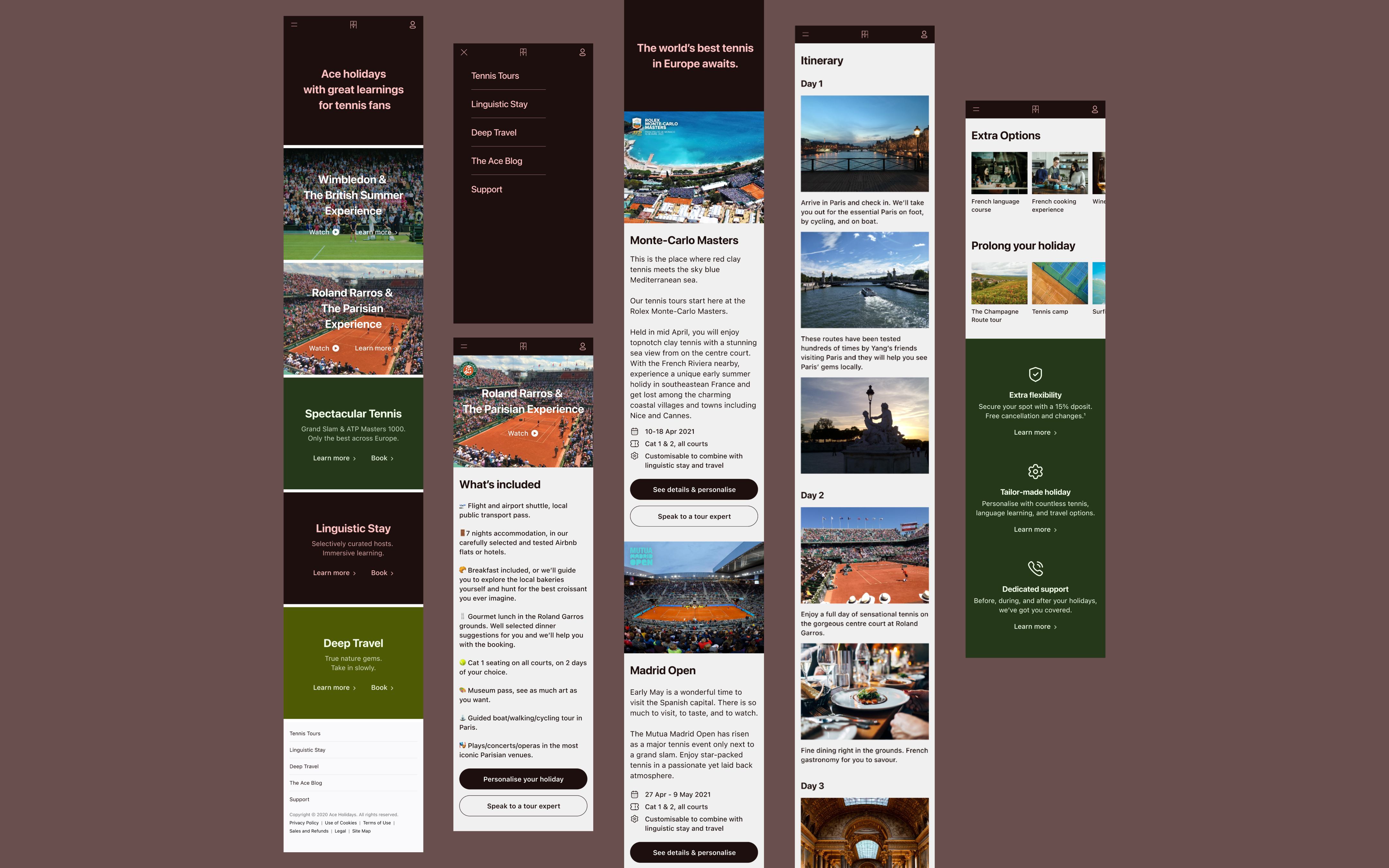
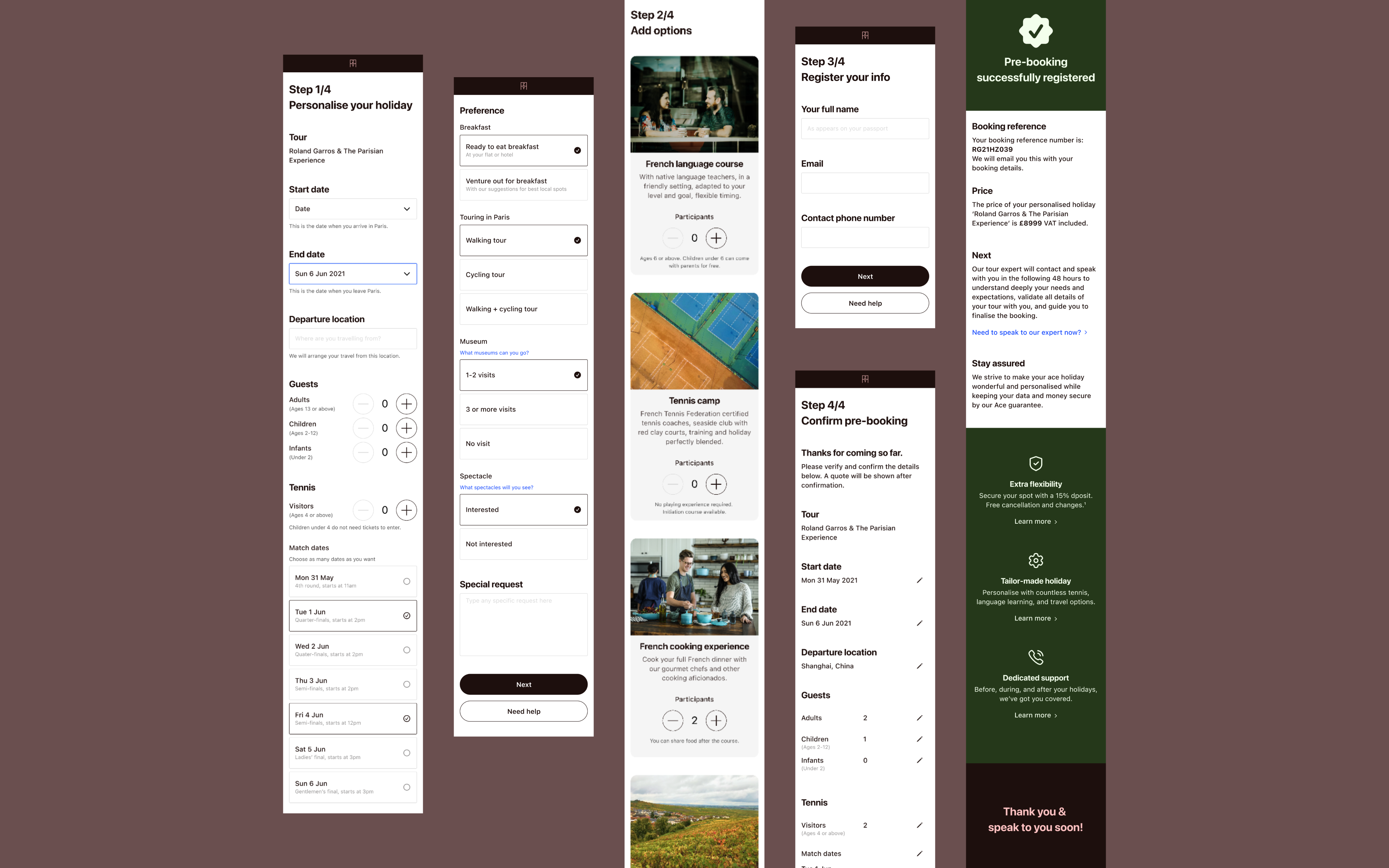
From left to right, top to bottom: home page, product category page, product page, booking, and confirmation.
![]()
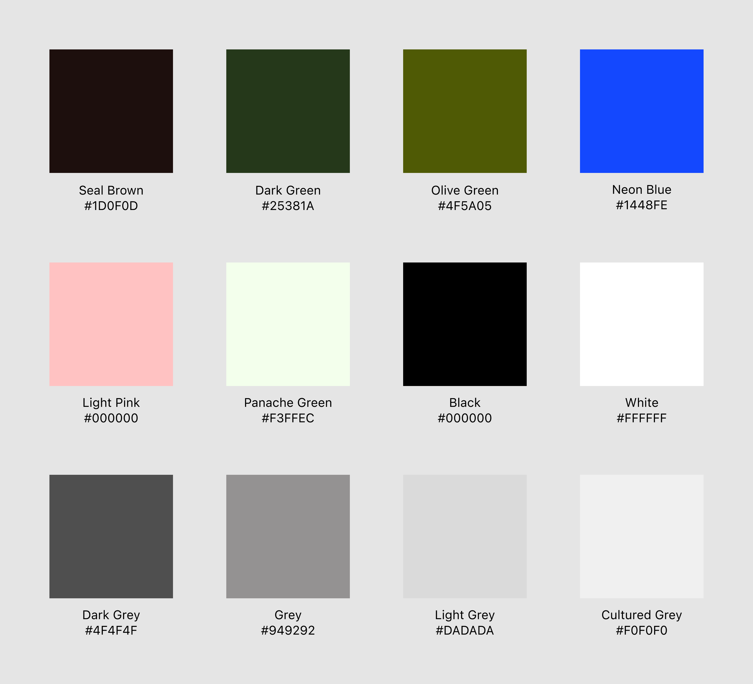
Design System
![]()
![]()
![]()
Screen Designs![]()
![]()
![]()
To understand users’ needs and define the user outcomes from the start, interviews have been conducted to find out the answers to three key questions:
1. What is the user trying to accomplish?
- Visit world class tennis tournaments and watch top level matches
- Tour the host countries and discover different cultures
- Learn to play or improve tennis with professional coaches during holidays
- Learn/improve languages in the native countries and in an immersive way
2. How does the user want to feel during and after this process?
- Excited, eys and mind opened, curiosity satisfied
- Great to have experienced what many have not
- Joy of playing and improving tennis game
- Happy to explore new countries/cultures and connect to new people
3. How does our product get the user closer to a life goal or dream?
- Be a person highly knowledgeable, having lots of experienced and travelled around the world
- Develop a great body and live a healthy lifestyle by playing tennis
- Connect to other people in different cultures, enrich social experience
User Journey Mapping

Product Research
There are a number of tennis tour organisers addressing different market segments.
What existing organisers fail to deliver is personalised holiday experiences promoting learning for tennis fans, adult and children.
Ace Holidays centres holidays on the best tennis in Europe, makes packages highly personalisable, and promotes various options of learning experiences.
Wireframes
My approach for responsive website design is as follows.
First wireframe on desktop to include all relevant information - this avoids missing any useful info during ideation.
Then design UI on mobile first from the desktop wireframes - this forces prioritisation and pushs further reflection on information architecture as mobile screens have more constraints.
From left to right, top to bottom: home page, product category page, product page, booking, and confirmation.
Design System


Screen Designs
